Icons for components
Configuring visuals to help editors (and developers) in Sitecore XM Cloud and XM/XP
SitecoreSitecore XM CloudSXAHeadlessDXPdocker
| Reading Time: 5 Minutes, 57 Seconds
2025-03-14
Sitecore XM Cloud is built around the structure from SXA, so we should really embrace and use the features available for the editor - and while I have had reservations regarding SXA in the previous (MVC-based) versions those are all gone now with the reworked Headless Sitecore Experience Accelerator. The Headless SXA is also available for XM/XP on-prem while making headless development. Even more important, Sitecore XM Cloud has the new and significantly improved Pages editor providing a new, redesigned and much faster visual editor with built-in editing - and in a new a much faster and user-friendly way than the traditional Experience Editor.
With Sitecore we have several options for customizing the editor experience and this is an important part of any development to ensure that the editor experience is as intuitive, fast and easy as possible - and basically maximize the value from your implementation.
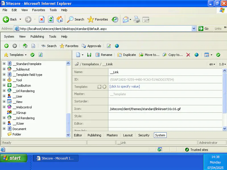
Icons for templates and pages
Since early versions of Sitecore, items in the content tree have an icon that will help the editor to easily recognize and distinguish the different types of items and sections. Below is a screenshot of the (very) old Sitecore 4 released more than 20 years ago, for the template you could back then specify path to the icon for the template.
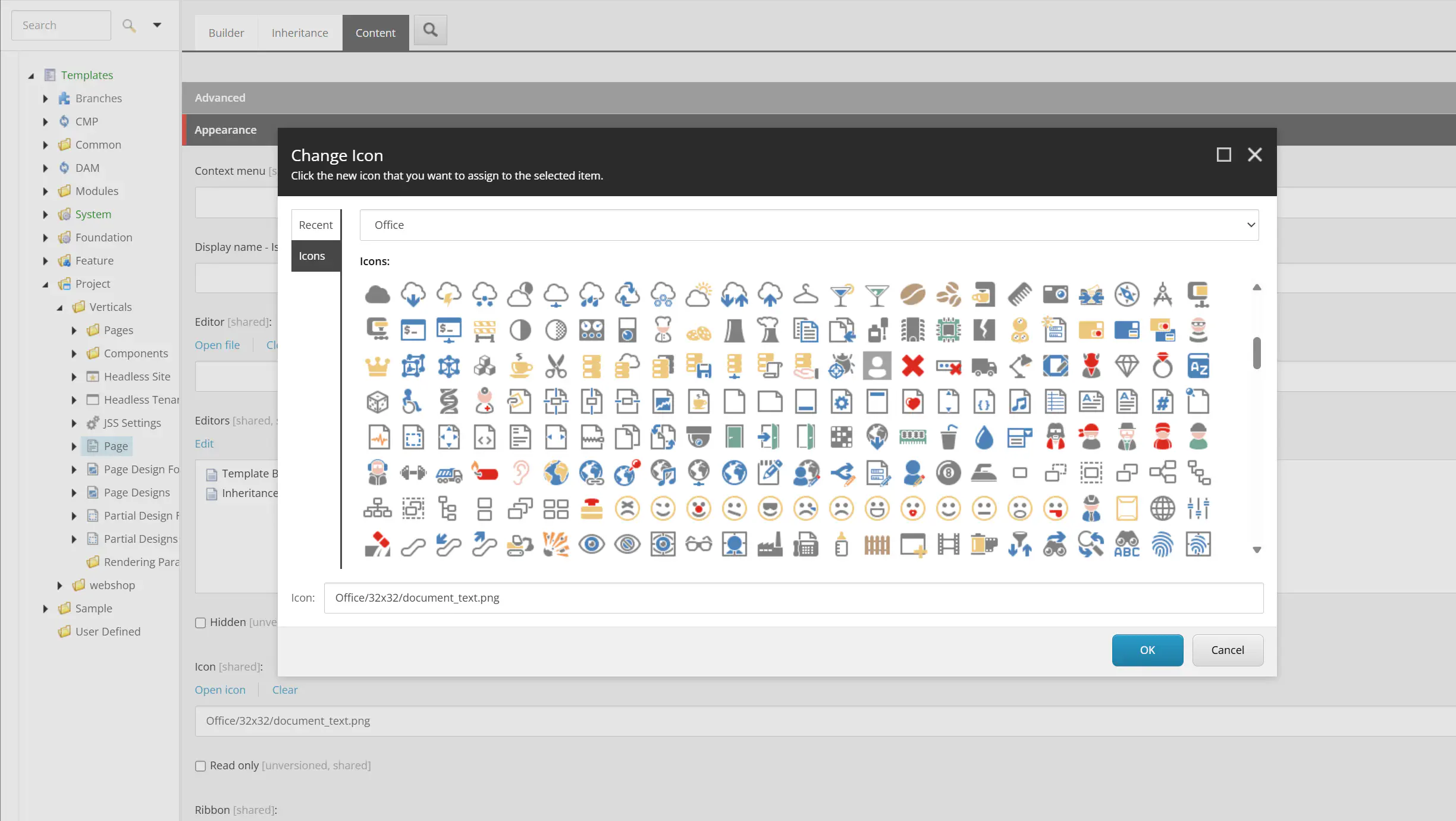
Also in more modern Sitecore versions, the icon is usually configured on the template where you can find the field Icon under Appearance (with View > Standard Fields enabled) with the “Open icon” link, a nice dialog let you choose among the icons available. Initially the icons were pretty colorfull but with SXA some icons with more “flat” design were added.
This icon feature was actually introduced before the concept of Standard values, so you can actually set the value on the template and it will be shown on both the template and the items based on that template - and the value is not shown on the items. You can also set it the usual way on standard values, but then the template it self is not shown with the icon.
It can be a bit overwealming to choose among all the icons so maybe you will find value in the community site Sitecore Icons Search1 where you can search the filename - and you can copy the value directly so you don’t have to wait for the dialog.
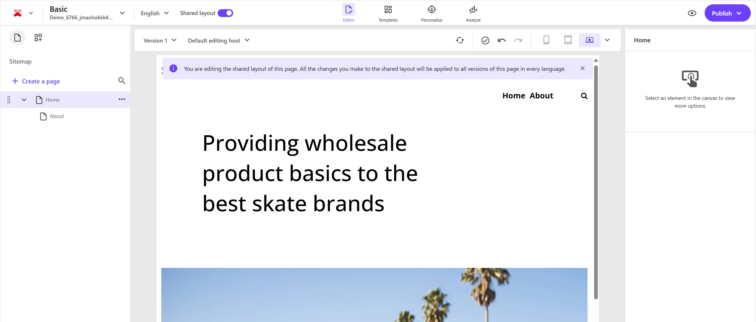
When using XM Cloud we have the new Pages editor which as mentioned is much faster than experience editor and you will still have (almost all) the options that were only available in the Content Editor, eg. you can see the content tree together with the representation of the page.
In this reprensentation in Sitecore XM Cloud the icons are not used, so there is at least less need for focus on the page and template icons.
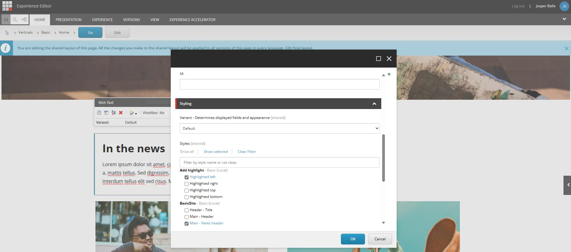
Icons for components
With SXA, renderings can be grouped in categories. This is configured at the site under Presentation/Available renderings. It can use the SXA shared site section features, so you can have a “shared” site with this configured or you can have it configured for each site individually.
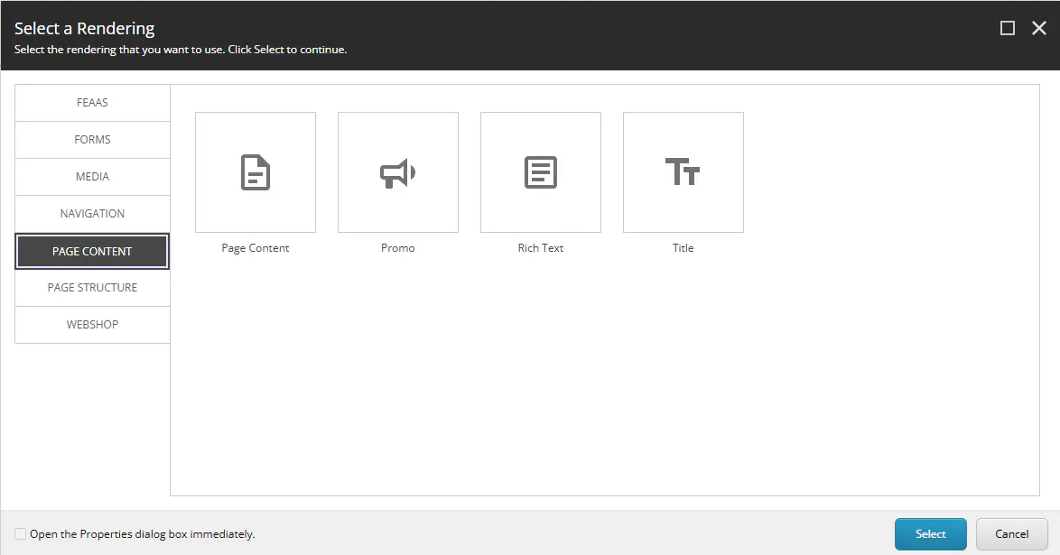
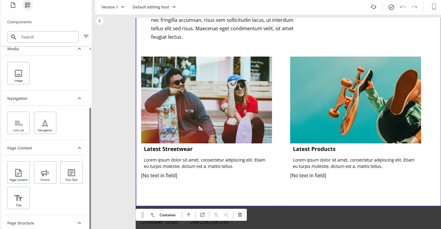
When inserting a component you will then get a nice dialog presenting the categories and the available renderings.
When inserting components with Pages in Sitecore XM Cloud the interface is a bit different but the same categories and icons are still used and visible for the editor-
Those icons are configured the exact same way as the template icons, in the icon field it is specified and is shown for the rendering in the content tree.
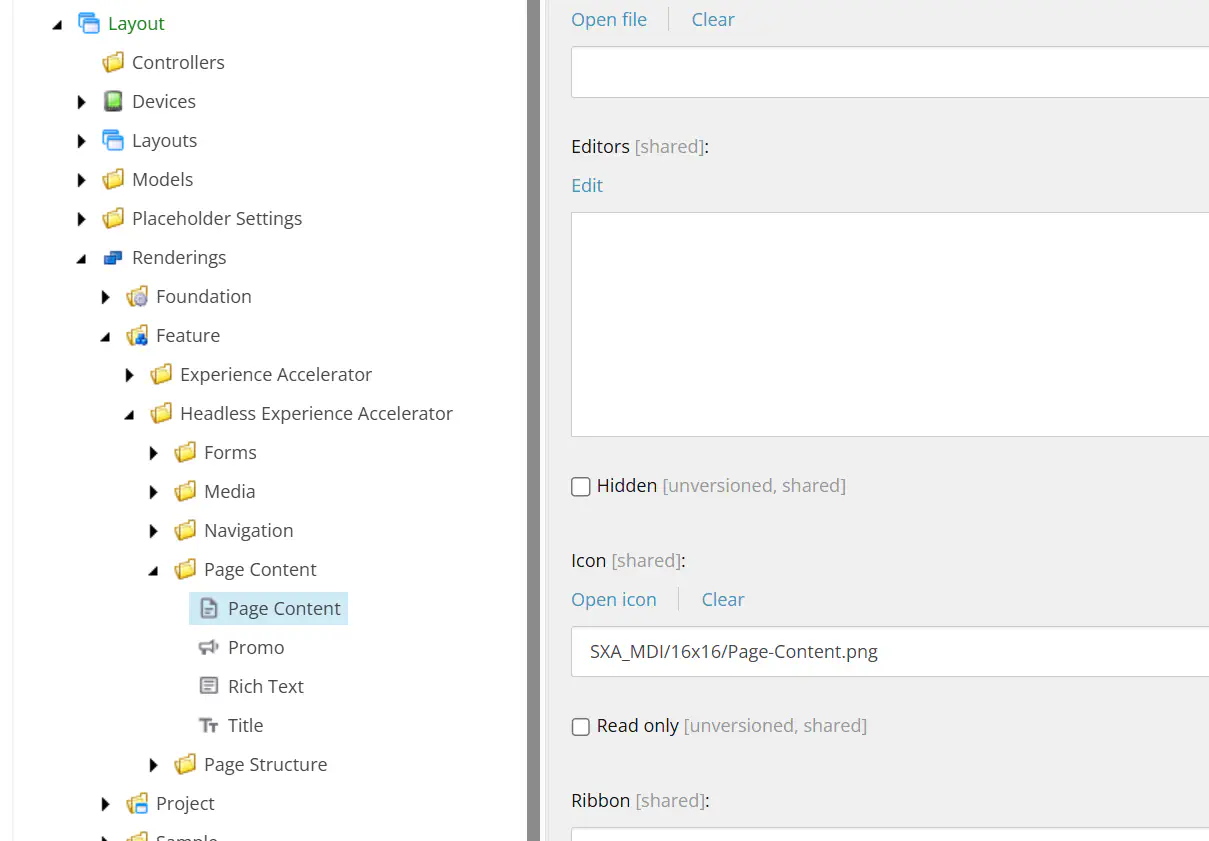
However, I was a bit surprised to see this, as I didn’t recall those icons from the dialog. You can also see in the screenshot above that the icon is coming from a collection called “SXA_MDI” that we don’t have in the icon selector.
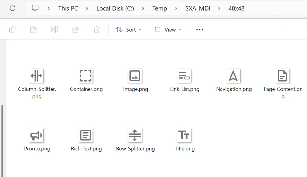
Those icons are actually distributed in a zip file within the installation and during runtime the icons are extracted and served from IconCache folder in temp directory.
We can copy those zip files to local disk from the docker images, expand the archives and have look by running this powershell command:
|
|
Here we can see all the icons available and also some new ones “SXA”, “SXA_GRID” and “SXA_MDI”.
Unfortunately there weren’t any additional icons for presentations that we could reuse for our own renderings. In the SXA folder there are some (from the older SXA for MVC) that might be usefull
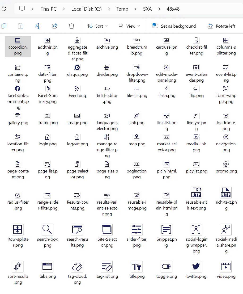
Customizing components with styles
Another feature in SXA is that editor has a lot of configuration options for each component both in regards to responsive behavior accourding to the chosen grid system but also some additional visual options. In the XM/XP you will see those represented as a long list of available styles that ce be applied:
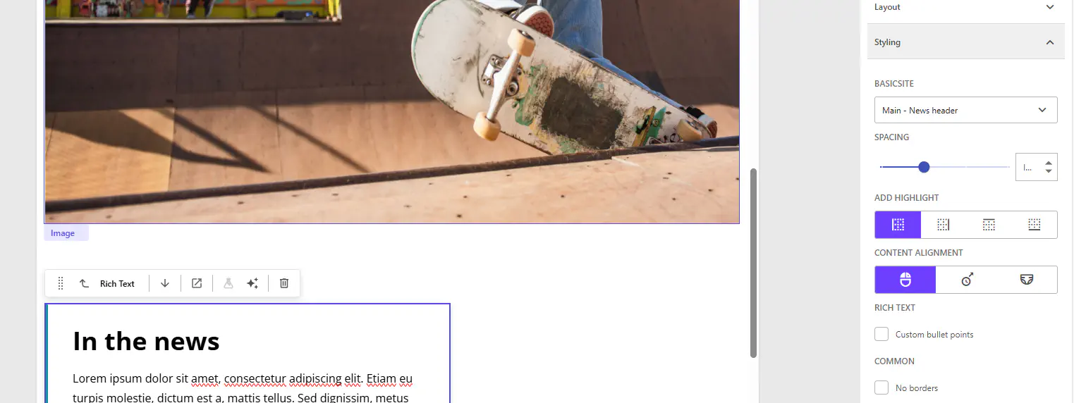
However, with Pages in Sitecore XM Cloud this has been extended significantly where you will see different types of inputs both dropdown, checkbox and even some radio button with nice icons such as content alignment.
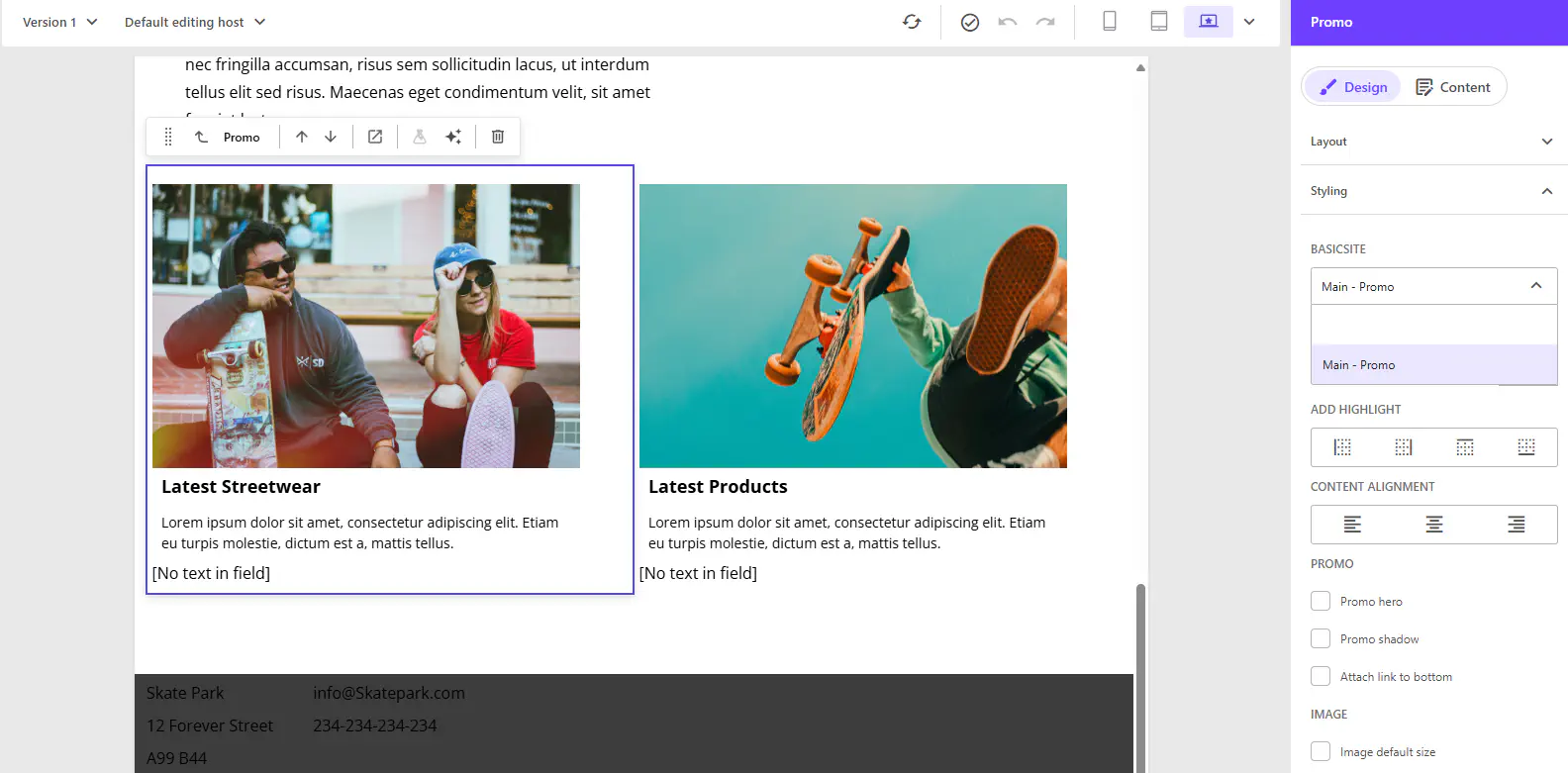
Is this really something that Sitecore has implemented on their own and just working for specific renderings or style options? No, this is also based on items and you can use this for your own styles, but it is working a bit different…
The styles are also located in the presentation section of the site in the content structure. When using the “basic site” module during site creation those will also be created and are configured for this nice experience in Pages.
For each “Styles” group there is a field to indicate how those styles should be shown. The options are (currently):
- checkbox-folder
- droplist
- icon-button-group-radio
- slider
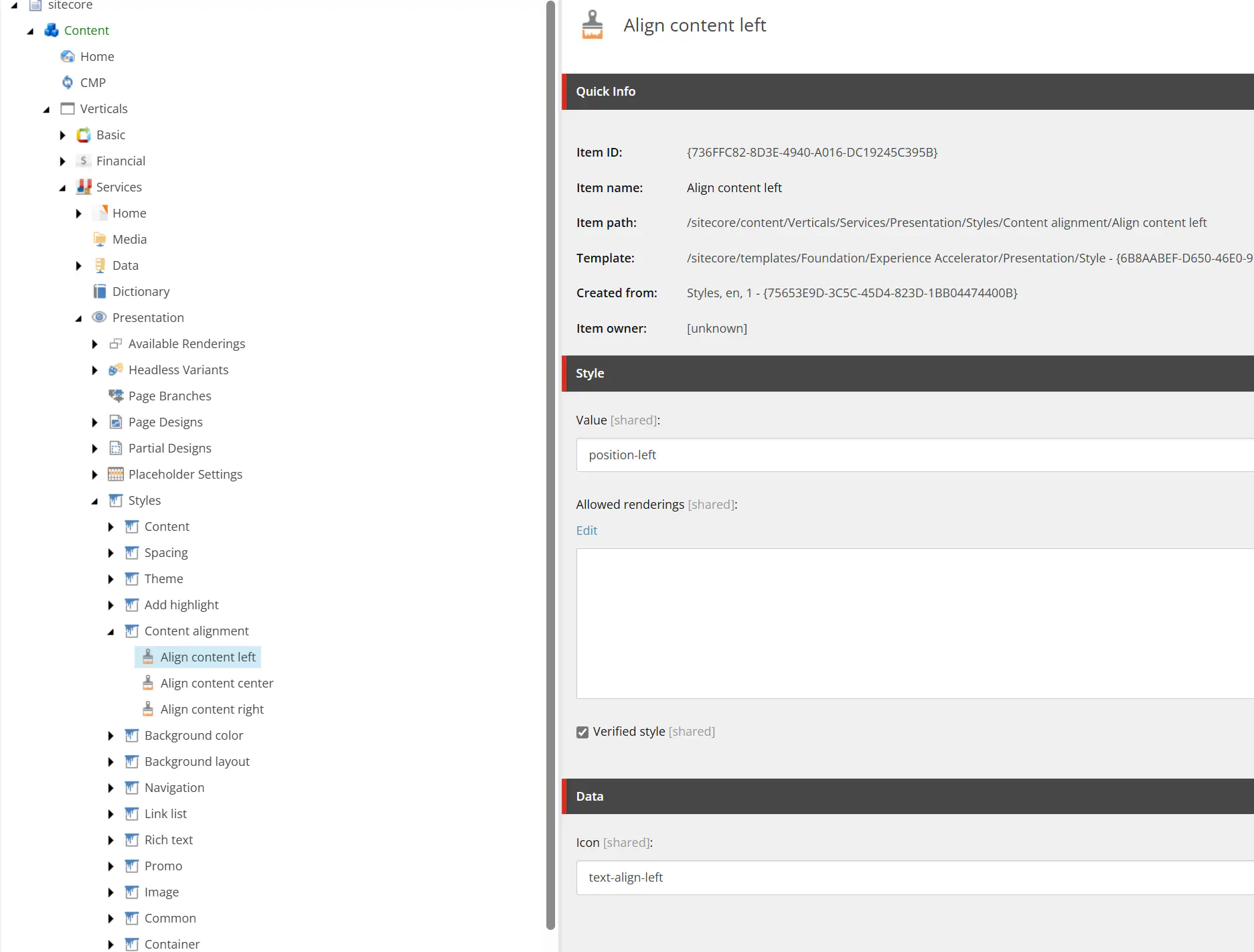
As child items are created the individual “Style” options, the value is the css class that will be available in the head as the property named “styles”. You can configure “Allowed renderings” and then the style options will only be shown for those specific components. If left empty, then the options are available on all components.
The last field “Icon” is a string but it is the one that points to the icon shown when using the “icon-button-group-radio”. The css class with an mdi- prefix gave out that the icon identifier is based on Material design icons. The prefix is automatically added during rendering, bu we can use all the icons. You can investigate the Material Design Icons2 and I tried changing a few:
I am even more happy to see that it is the latest version of the icon library that is being used, currently at least. Currently it is version 7.4.47 and I tried with inserting one of the new icons added in this version.
The actual styling of the selected styles
It is no surprise that while the selected styles are jsut css classes that will be available in the layout response, it is up to the head to implement the actual styling so that applying those classes have (the intended) effect on the actual component and web application.
During configuring the SXA site, it is also selected a grid system such as Bootstrap or Tailwind that will be used for the configuration of behavior and breakpoints. However, the styles are not effected by this selection, so the configured css class for “Content Alignment Left” is not text-start as you could expect from Bootstrap but it is actually a completely different position-left (in the basic site default styles).
The styling for this css class is implemented with Sass in the NextJS Head Start application3 while in the ASP.NET Core starter template, the complete bundle for the skatepark demo site is included4 and hereby also the utility css classes.